
~12 min read
CaCa · Case study
CaCa — a ride-hailing platform in Yangon
19 months as the only designer on the team. Five surfaces, three scripts, a four-month MVP — live in stores. This is the long version.
01 · Why CaCa exists
CaCa · Case study
You can't copy Uber in Yangon
CaCa means 'taxi' in the local dialect. The project started as MyanGO — renamed after the name clashed with an already-registered company — and set out to build something the city didn't have: a complete ride-hailing ecosystem. The catch — global patterns don't survive here. Payments run cash-first, networks drop, phones are low-end Android, and the interface has to hold three writing systems that share nothing.
02 · My role
CaCa · Case study
The only designer on the team
Every screen across five surfaces went through me — product design, UX structure, UI, branding support, and the website. Engineers built, operations ran the fleet; I owned how all of it looked, flowed, and explained itself. The job wasn't drawing screens. It was turning business needs into flows people could actually follow.
03 · The challenge
CaCa · Case study
Not one app — one operating system
A passenger booking a ride, a driver accepting a job, an operator untangling a dispute — different users, different interfaces, one connected system. Three problems shaped everything: making fragmented needs feel like one product, designing for real conditions instead of ideal flows, and moving at MVP speed without wrecking the structure the future needed.
04 · Ecosystem map
CaCa · Case study
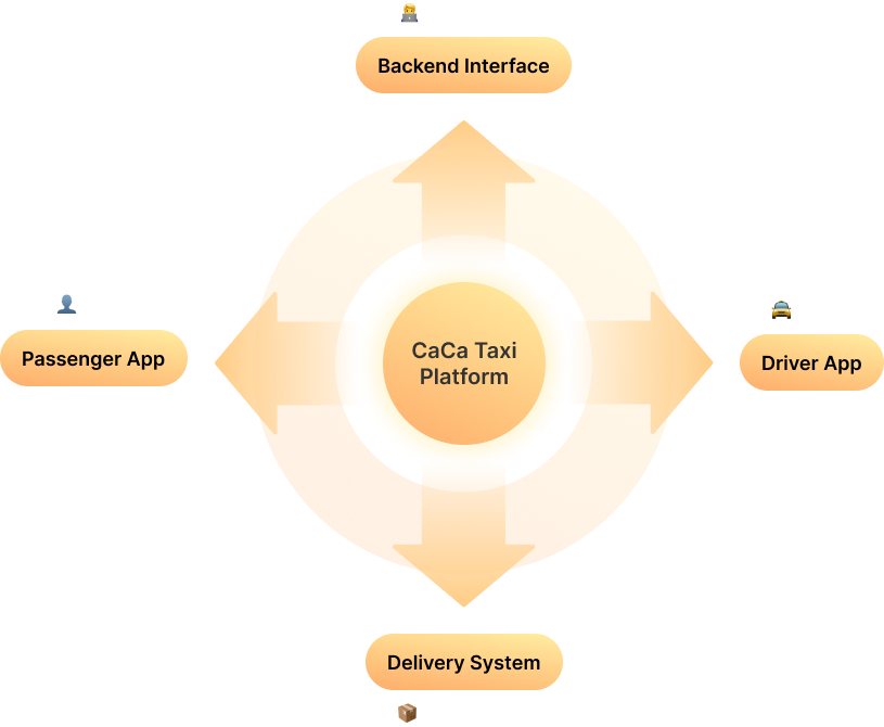
One loop connects everything
Passenger request → driver acceptance → trip tracking → payment → backend management. I mapped the platform as a single loop before designing any screen — it showed where each role enters the system, and where information has to cross between apps and internal tools.
05a · Passenger app
CaCa · Case study
Booking that explains itself
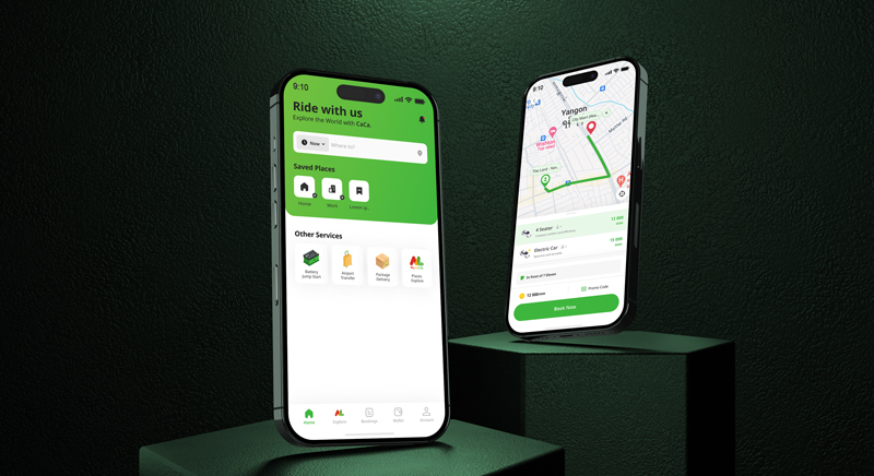
Registration, booking, location selection, tracking, payment, trip status — the flows every ride app has, rebuilt for users who may be on their first smartphone and a bad connection. Every booking state is visible and named, so the app never leaves you guessing whether a car is actually coming.
05c · Delivery
CaCa · Case study
Same loop, different cargo
When the platform expanded into delivery — including a bicycle fleet — I refactored flows on flow diagrams before touching screens. Where the ride logic held, we reused it; where a parcel isn't a passenger (handoffs, recipients, proof), the flow forked. Diagram-first kept the refactor honest.
05e · Marketing site
CaCa · Case study
cacataxi.com — designed and built
Four surfaces were mine to design. This one was mine to design and build. cacataxi.com is where a first-time rider decides whether CaCa is real, so it carries three jobs at once: explain the service, earn the trust, hold the identity the apps had already set. I structured it around those three — responsive from phone to desktop, and holding the same tri-script discipline the product ran on: English, 中文, and မြန်မာ on one page with no shared baseline or rhythm. Designed and developed end to end, by the same hand that drew the screens it points to.
06 · Design system
CaCa · Case study
One language across five surfaces
Tokens, components, a shadow ladder, and type that holds EN · 中文 · မြန်မာ on the same screen — three scripts with no shared rhythm, baseline, or line height. The system is what let one designer keep five surfaces consistent while the roadmap kept moving.
07 · The unhappy paths
CaCa · Case study
Designing for when it goes wrong
Network unstable, no drivers nearby, payment failed, GPS drifting — in Yangon these aren't edge cases, they're Tuesday. Every critical flow got explicit failure states, because the moment something breaks is the moment an app earns or loses trust.
08 · Local context
CaCa · Case study
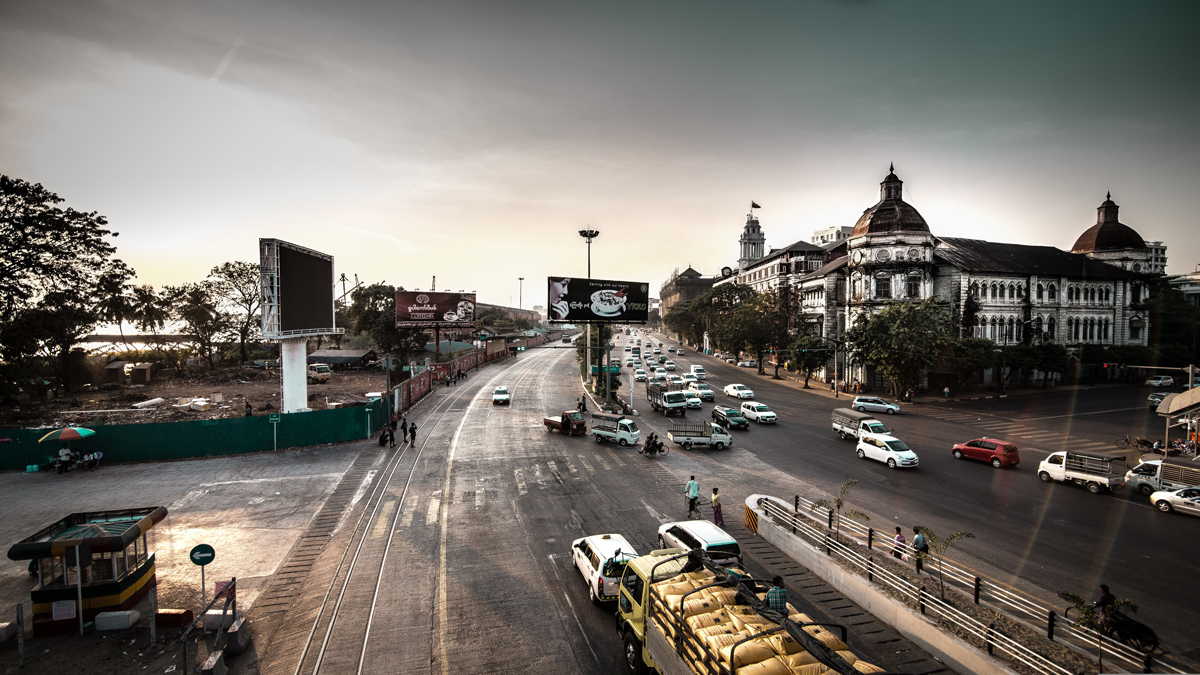
Designed for Yangon, not for app stores
Cash-first flows, with cashless built on a KBZPay partnership — CaCa was the first ride-hailing platform in Myanmar to integrate the wallet people actually use, rather than card rails. Tri-script interfaces over English-only. States that assume the network will drop. None of these were compromises — they were the brief. The global playbook was the thing to resist.
09 · Outcome
CaCa · Case study
Shipped, and still running
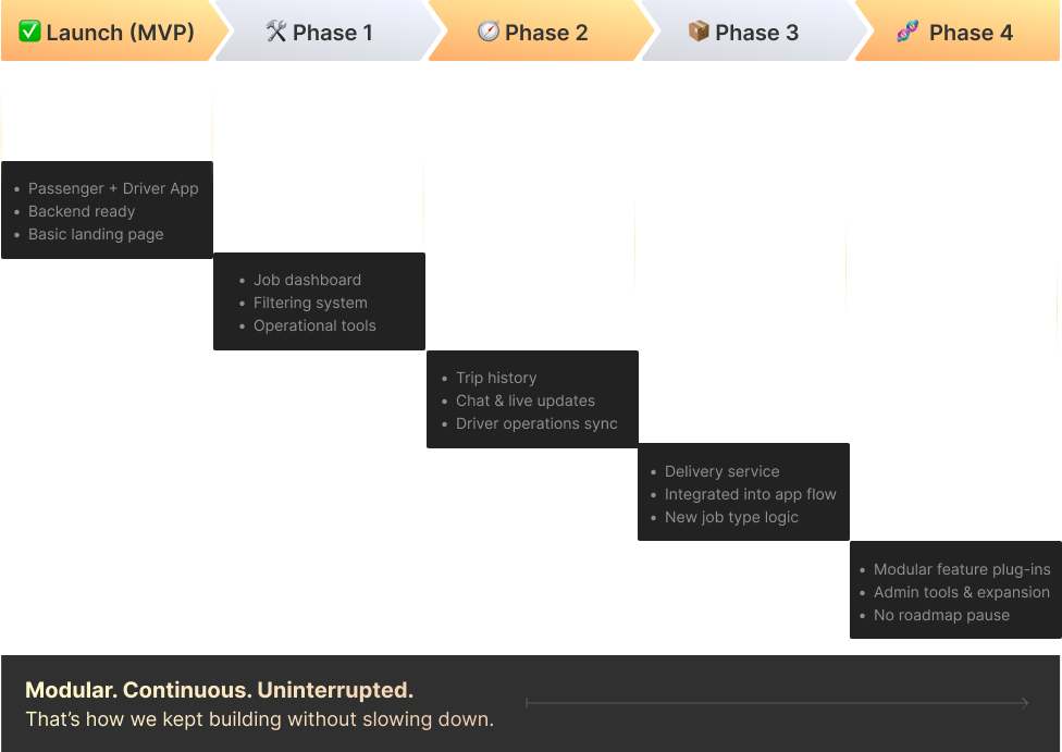
A four-month MVP grew into a full platform: passenger and driver apps live in stores, delivery flows, an 18-module backend, a first-in-market KBZPay partnership, and a public site — a product foundation that still serves Yangon today.
10 · Reflection
CaCa · Case study
Start with the workflow, not the screen
CaCa taught me to design ecosystems, not screens: understand how users, operations, business goals, and technical constraints connect — then turn that complexity into a flow people can actually use. Real workflow first, roles second, system map third. The interface is what comes after.